← Lab
One grid, one ink
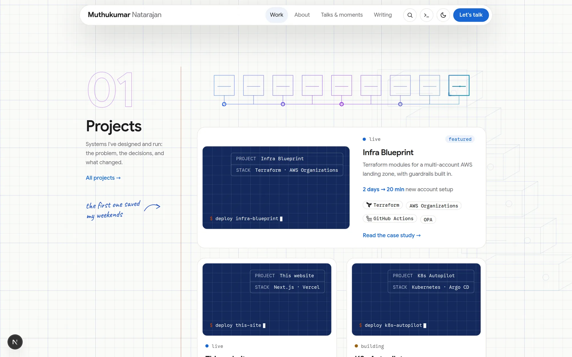
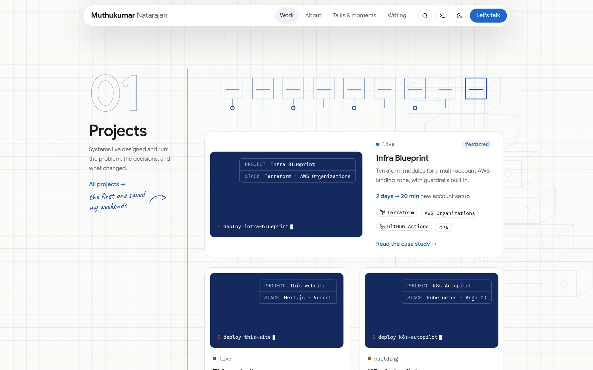
The notebook had a grid on the paper, another inside every card, and a three-colour gradient on every drawing. Taking two of the three away made it calmer and faster.
- type
- sketch
- date
- 2 Oct 2026
- reading
- 1 min
- CSS
- Design tokens
Before: the page paper had a two-scale grid, every project cover and the contact panel drew their own grid on top, and the drawings used a blue → violet → teal gradient. Three textures and three colours competing for attention.
After: the paper is the only grid (one scale, fainter), cards are plain surfaces, and every drawing uses one ink
colour. The orange --signal colour is kept for the one thing that matters in each view.
What changed in the code
styles/globals.css: the body background went from four gradient layers to two.styles/tokens.css:--story-1/2/3now all equal the ink colour, so every drawing follows without touching a component.- The grid textures inside project covers, post cards and the contact panel were deleted.
What I learned
- Texture works once. Repeated at three scales, it turns into noise.
- Tokens pay off: collapsing a gradient into one ink was a three-line change in one file.
- Calmer also measured faster: scrolling the home page went from 89% to 20% main-thread time on a slow phone (most of that came from pausing animations, but there was less to paint, too).